Flex Layout
Flex mode can be set in Auto Layout by clicking on the icon in the Display setting.
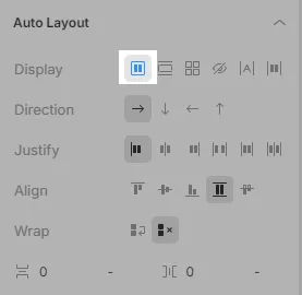
In this mode, you can flexibly control the layout of child elements inside their parent flex container. In Flex mode, you can put child elements in a row or a column, align horizontally and vertically relative to each other, setup wrapping, and adjust spaces between elements.
You can position child elements in a container with two types of settings:
- Auto Layout is applied to a parent element (flex container) to customize the layout of its child elements
- Child Layout – is applied to a child element to setup its custom position
Auto Layout is set on a parent element but affects child elements.
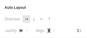
Auto Layout properties:
Child elements are positioned horizontally, vertically (and vice versa) within a flex container. The direction defines the main axis along which the child elements are aligned.

- Row (horizontally) - All elements are arranged in a row from left to right.

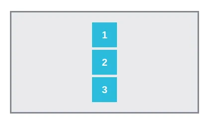
- Column (vertically) - All elements are arranged in a column from top to bottom.
- Row-reverse (horizontally) - All elements are arranged in a row from right to left.

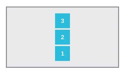
- Column-reverse (vertically) - All elements are arranged in a column from bottom to top.
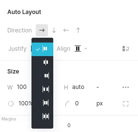
With Justify option you can align child elements within a flex container along the main axis. If horizontal Direction is selected, this will align the elements along the horizontal axis. If vertical Direction is selected, this will align the elements along the vertical axis.
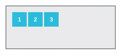
- Start - Elements are aligned from the beginning of the axis.
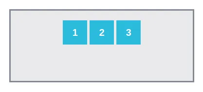
- Center - Elements are centered.
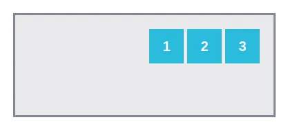
- End - Elements are aligned from the end of the axis.
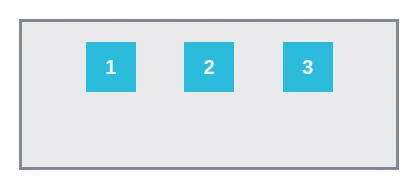
- Space between - Elements are distributed evenly throughout the container. The first element is at the beginning of the container and the last one is at the end.
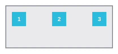
- Space around - Elements are distributed evenly throughout the container with equal spacing around them. Note that the spacings are not visually equal as all elements have the same margins on both sides.
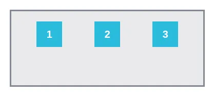
- Space evenly - Elements are distributed so as to have equal spacing between any two elements (and distance from one edge to another).
With Align option you can align child elements within a flex container along the perpendicular axis. If horizontal Direction is selected, this will align the elements along the vertical axis. If vertical Direction is selected, this will align the elements along the horizontal axis.
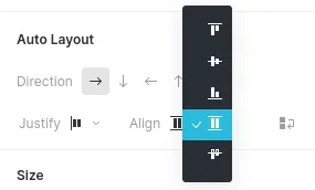
- Start - Elements are aligned from the beginning of the axis.

- Center - Elements are centered.
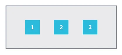
- End - Elements are aligned from the end of the axis.
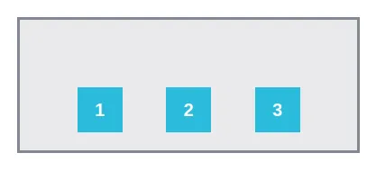
- Stretch - Elements are stretched to fit their parent’s size.
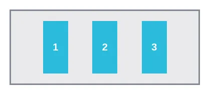
- Baseline - Elements are aligned to their baselines (invisible lines that the text sits on).
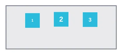
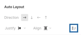
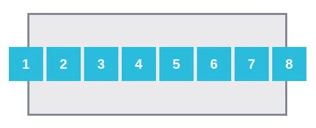
With this property you can enable wrapping child elements of a flex container if they do not fit on one line. By default, child elements are on the same line, and the container may overflow. Wrap helps avoiding this.
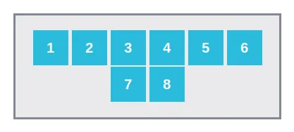
You can use Align Content for aligning multiple rows horizontally and vertically.
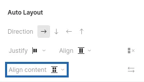
- Start - Rows are aligned to the top or left of a flex container, respectively.
- Center - Rows are centered vertically or horizontally within a flex container, respectively.
- End - Rows are aligned to the bottom or right of a flex container, respectively.
- Stretch - Rows are stretched to fill empty vertical or horizontal space.
- Space-between - Rows or columns are distributed evenly from top to bottom or right to left of a flex container, respectively.
- Space-around - Rows or columns are distributed evenly relative to themselves and the edges of a flex container.
- Space-evenly - Spacing between rows or columns and from the edges of a flex container to the outermost elements is the same.
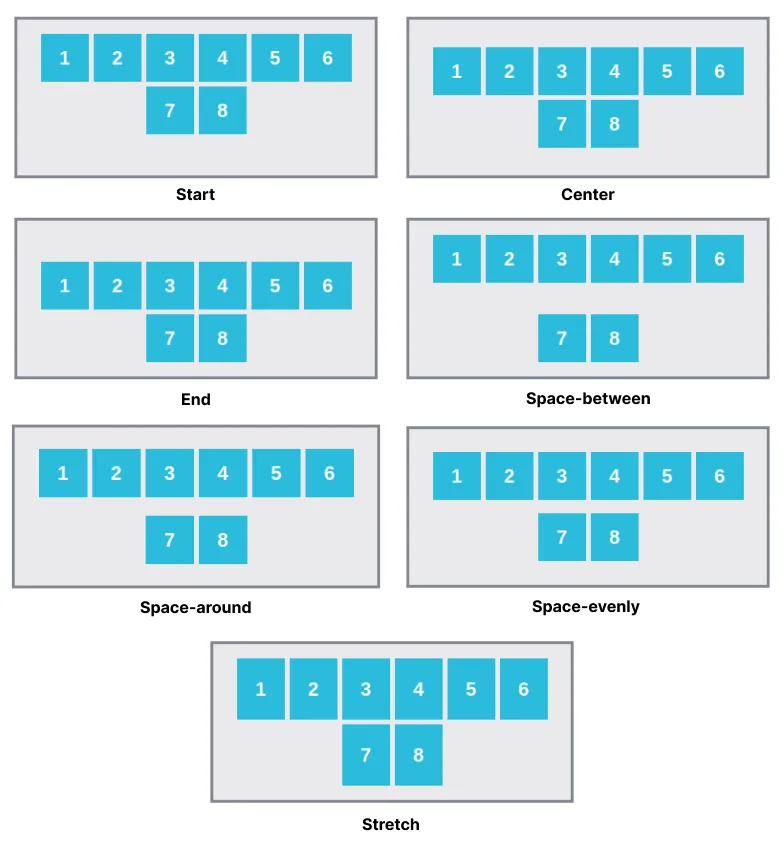
The order of the rows along which all the elements in a flex container are distributed is reversed.
Gap is used to set the distance between columns and rows and not along the edge of the container. Adjusting spacing helps keeping the proportions inside the parent element and align the content with the container's borders.

For example, you can arrange images in the center of the container, setting the desired spacing.


You can also use spacing between columns and rows with widgets that form lists:
Gap feature cannot be used with the Block List widget
To set spacing, select a parent element with the desired list on the Canvas or the Layers tab in the left panel.
You can set two types of spacing:
- Row spacing
Sets the spacing between rows.

- Column spacing
Sets the spacing between columns.

By default, column spacing is set to «normal». Spacing will depend on the browser. You can set the spacing in the following units:
- Pixels px
- Percentage %
Spacing is set as a percentage relative to the size of the parent element.
- Em
Spacing is relative to the parent element’s font size. 1em is equal to the element’s font size in pixels. The size changes in proportion to changes in the font size.
- Viewport Width vw
Spacing is set as a percentage of the width of the browser window. 1vw is equal to 1% of the current width of the browser window.
- Viewport Heightvh
Spacing is set as a percentage of the height of the browser window. 1vh is equal to 1% of the current height of the browser window.
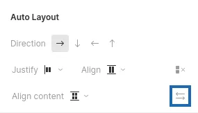
To set proportional gaps quickly, click the clip button. After clicking the clip button, set either the gap between rows or the gap between columns. The second parameter is set automatically.

Reloading the page will reset the setting. However, this will only affect the way you work in the Design Editor. The changes will not affect the project.
Child Layout settings are used to setup child elements and allow you to determine child elements’ behavior when a parent element is resized, as well as set custom alignment and order in relation to other child elements.
Child layout properties:
The property shows how much an element will shrink or grow relative to neighboring elements when the container is resized.
- Grow and Shrink can have any integer value from 0 and more.
- 0 means that the element does not shrink or grow when the container is resized.
- 1 and more means how many times an element shrinks or grows relative to other elements when the container is resized.
For example, if the first element has a Grow value of 2, the second one – 1, and the third – 0, then when the container is resized, the third element will keep its size, the first and the second will share the free space in the container in proportion to the Grow values.
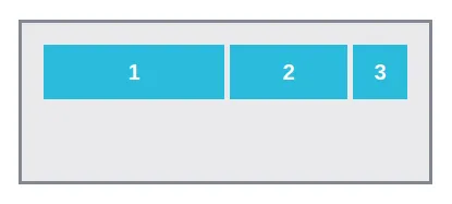
You can also set the Basis size, which defines the size (in pixels or percentage), from which the element will shrink or expand. By default, the value is set to auto.
With Align you can position a child element along the main axis separately from the others. For example: the properties of a vertical flex container align all the child elements to the left, but with the Child Layout – Align the selected element can be positioned in the center.
With Order you can change the ordinal position of a child element in a flex container, i.e. make it first, last, or set a custom order.